Home Search Gallery How-To Books Links Workshops About Contact
Colorvision
Spyder2 PRO Studio Test Review 
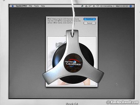
I'd get Spyder2 Express here, Spyder2 Suite here, Spyder2 PRO here, Spyder2 Plus here, or I'd get any of them here, and the explanation of which does what in the article below INTRODUCTION The ColorVision Spyder is super easy to use and well worth the $63 - $300 it costs, depending on the package you choose. I remember when these instruments used to be complicated, cost $10,000 and did a lot less. You don't need any color, contrast or even brightness controls on your computer or monitor. The software controls everything. It transformed the screen of my iBook from a soft, whimpy blue to solid, warm, delicious, vivid and accurate color. Look at the snapshot above of the Spyder stuck on my laptop's previously calibrated screen. Does it look neutral gray? It sure does! I got one of these when I got a laptop with an LCD screen. The Colorvision Spyder makes a huge difference not just in matching my prints, but also it makes my images look fantastic on everyone else's screens, like yours. It allows your monitor to match industry standards. This lets you create images on your monitor to look as good as possible on as wide a range of other people's monitors, as well as giving you prints as they looked on your monitor. It doesn't necessarily make the images on your monitor "better." It makes them match accepted standards. I learned this working in Hollywood: it doesn't matter what it looks like on your screen; it matters what it looks like on everyone else's. Most people, including myself, love images on a calibrated monitor. If you use any laptop or flat panel LCD monitor I'd suggest you also get one of these. This is because LCDs vary wildly from brand to brand. LCDs almost always look great, however if you don't calibrate them they probably won't match anyone else's monitor. That means images you carefully create on your monitor probably won't look as good anywhere else. Since I publish and share all my work it's important it look good everywhere. THE SYSTEM The system is two pieces. One is a CD ROM with the software. The other is the hockey puck with a USB cable you see above. It comes in a well designed box with a custom foam insert which can be used as a great cheapskate case. See also Colorvision's own site here for details. These change faster than I can update ths page. The various versions of the system offer software with more or less tweaks, and also additional software unrelated to calibration. No one has been able to tell me what I'm supposed to do with the DoctorPRO and Colorist software that came with my Spyder2PRO, the most expensive version. I suspect most folks will be very happy with the least expensive Spyder2express, if its few presets are what you need for your monitor. You need 6500K white point for CRTs and native white point for LCDs. The most expensive versions are for nuts like me who want to make absolute chromaticity measurements. The fancy versions also let you calibrate your monitors to arbitrary nonexistent non-standards, which seems pretty silly. All the current systems use the same sensor and are equally accurate, so long as the offer the settings you need. THE SENSOR The Spyder sensor has a pull out honeycomb. You leave the honeycomb in for LCDs and laptops and take it out for conventional CRTs. The honeycomb restricts the angle of acceptance so it's not fooled by the color variations seen from the sides of LCDs. There is a sliding weight stuck on the cord. You move it up and down along the cord. The weight balances the sensor while it dangles in front of your monitor. For my LCD I let the weight clip to the top of the monitor and let the spyder hang at the correct position. BASICS: CRT vs. LCD and How to Calibrate Them (click) PERFORMANCE Installation EASY! This was my biggest fear. I plugged in the sensor, popped in the CD and kept hitting all the defaults. Before I knew it I had my profile and it looked great! It's easy to install, easy to use and it just works. I can't say enough good about it. Everything should be this easy. Usage Be sure to turn off your screen saver, since it will take 7 minutes to run and you won't be using the computer. If the screen saver pops on or the screen automatically dims you have to start from scratch. If you don't know how to deactivate the screen saver then wiggle the mouse on one side every so often, or keep hitting the SHIFT key, to keep it awake. On my Mac I go into Apple Menu > System Preferences > Energy Saver and slide the "put the display to sleep" slider to "Never." Remember to put it back when you're done. As you click the next arrow it will eventually ask you to stick the sensor on the middle spot of your monitor as I show in the photo above. It then throws up a series of test colors and measures them for 7 minutes total. At the end it's created a color profile you name and save. I always put the date in my profiles so I can tell them apart. Gamma Preferences Use 2.2, the standard for sRGB, Adobe RGB, television and video. Macintoshes used to be set to 1.8. I set my Macs to 2.2 so I see what matches the rest of the world's sRGB monitors. 2.2 will look darker than you're used to on Mac. Contrary to common fear, this is least important for PhotoShop. PhotoShop actually corrects for whatever monitor gamma you choose, so setting 1.6 or 2.4 still looks the same in Photoshop! Just try it. Of course these will look wildly different in your web browser or anything else. If you have to ask, just use 2.2 for Mac and PC. White Point Preferences for LCDs When it asks you for your preferences, tell it white point = Native if you're on a laptop. Don't click that you have any monitor settings to tweak. Turn your brightness all the way up and enjoy. Native means that it doesn't try to change the white point; it leaves it exactly where the backlight of the LCD already is. I suggest Native over 6,500º Kelvin because the profile will have to reduce the brightness of the whites of the LCD to correct the LCD's color. This is because an LCD is really a clear screen with variable transmission placed over a fluorescent background. To change the whites the transparency of the screen is reduced in one color or another instead of being clear. It would be fine to set 6,500º K on a very high quality desktop monitor that has a 170º viewing angle both horizontally and vertically like the Apple Cinema Displays. Of course the Apple Cinema Displays just happen to have native white points at almost exactly 6,500K anyway. On most monitors and laptops the LCDs change color and brightness as you look at them from above or below. The whites always look white, but other colors tend to look lighter from above and darker from below. If you set the calibrator to adjust the white point you will now see a variation of the white point from the top to the bottom of your screen on most monitors! This looks awful when you work on text or other white fields . Play with this if you like, or save yourself the trouble and choose Native for white point with an LCD unless you have one of the $3,000 Apple Cinema Displays. Go ahead and try setting 6500K for your LCD if you want. You won't hurt anything. Colorimeter Mode The fancier versions of this calibrator will measure and tell you your LCD's native white point. My iBook's native white point is 4,780K, delta uv 0.3 and luminance is 23.4 fL as of December 2005. My Kaiser light table measures 800 fL and 4,870K with a delta uv of 0.03. This is another huge advantage of slide film: a light table has ten times the brightness of a computer monitor! I don't see conversion ability in the photometer, however one foot-Lambert (fL) is 3.426 Candelas per meter squared (Cd/m^2) if you need to convert. The inverse is 0.2919. White Point Preferences for CRTs For traditional CRTs choose white point = 6500º Kelvin and Gamma = 2.2. This is the standard for both sRGB, Adobe RGB, television and DVDs. People who worry too much worry themselves sick over this; Photoshop cancels out any weird settings anyway. Just like gamma, PhotoShop is stupid-resistant and actually corrects so no mater what white point you pick, Photoshop displays the same thing. Try it! The biggest difference will be seen in regular applications like your web browser and email. It's not that important since eye tends to compensate for white point regardless of what you choose. If you know where the RGB manual adjustments are, check the boxes to allow you to set them. Setting the RGB and brightness and contrast on the monitor before making a profile will let you get the very best quality. This is the precalibration feature of the Spyder: it looks at the screen and tells you where to move the settings. This is because, unlike an LCD, the CRT is totally analog and makes whatever colors it does based on how many electrons shoot out of the gun at the back of the monitor. It's best to adjust these first so the computer then has complete control over the entire range. Consumer TVs and out-of-the-box CRT monitors tend to be set at 9,300º K. This was started by the Japanese to give an unfair look of brighter, whiter white when set beside other TVs on the sales floor. The Hollywood SMPTE standard for television and monitors and sRGB, etc. is the warmer 6,500º K setting. Of course we in Hollywood laugh that we color correct all the DVDs and TV shows on 6500K monitors which are then viewed at home on 9300K monitors. It's not a big deal; your eye compensates automatically. Some people in print supposedly like 5,400º K. This looks way too orange for me. Sensor Placement For LCDs just stick it in the center as I show above. CRTs vary across the screen. That's one of the reasons we pay $30,000 for the CRT monitors we use for making DVD telecine masters in Hollywood: they are consistent from left to right. Even on these $30,000 monitors we get different readings at different points on the screen. My 23" Viewsonic PF-815 is cooler in the center and warmer around the edges, so I tend to stick the calibrator about 1/3 of the way out to the edge. You can fiddle with this if you please, or ignore it and leave it in the center. Measurement Time Software Version 1.5 took about 15 minutes to scan. Each color patch pops up for about 15 seconds. This lets it make the most precise possible reading. Software version 2.0, which is a free upgrade that came out in 2005, improves this to 7 minutes. Accuracy and Repeatability It looks great! It was dead on the first time I tried, and matched every other time I ran it. I didn't have to fiddle around to get a good profile. The only fiddling I did was to try different settings out of curiosity. Trust me, use the standard settings I suggest above and you'll be fine. The instructions caution to calibrate in a dark room at midnight under a new moon. Curiosity got the best of me as usual and I also made a profile in the day with all the lights on. The profiles matched exactly! Therefore I don't worry about the lighting when calibrating. I just ensure that there isn't any direct sunlight. This was on my LCD; I suspect you will have a problem with a CRT since the glass is so much thicker and can allow room light to sneak in. I'm also impressed that the next time I ran a profile that it also matched exactly. There is no need to fiddle around to get a good profile: the first try was perfect, and so was every other. Even from month to month I get the same results, which also goes to show that my Apple iBook laptop doesn't vary. I suspect with any quality LCD that you could borrow a friend's calibrator and be set for quite a while, like until you get a new laptop. I used to work for Tektronix in 1996 who at that time made a $3,000 monitor calibrator. The designer of that tester was adamant about how it was more accurate than some other testers that cost many times more. It turns out the Tektronix tester used narrower-band Scott glass filters which gave it more accuracy than the $10,000 testers, although the narrow filters limited its sensitivity at dark levels. The designer could go on and on about how the other $3,000 - $10,000 testers weren't as good, and he knew his stuff. Later I asked him how good these little USB based $300 testers could possibly be. Surprisingly he said they could be fine, so long as you didn't leave them out in the light which could cause their gel filters to fade. I was amazed! When I asked how these inexpensive probes could possibly be any good the answer simply was that the USB probes are designed to work over a much smaller range of light and color, thus they can cost much less. These $300 testers are also slower: one reading every 10 seconds, as opposed to the lab meters, which give several readings each second. The $10,000 lab testers are designed to work over broad ranges of illumination and temperatures etc; the USB testers just do home and office monitors. It still seems too good to be true, but in any case I'm very happy with the results regardless of my skepticism. Compared to Monaco The Monaco system does a similar job, but faster. On the downside you have to make a black reference measurement against your desk which you don't have to do with the Spyder. I think I get more consistent results with the Spyder. The Monaco is better if you want to calibrate scanners and printers, too, which this Spyder doesn't do. I prefer the results of this ColorVision Spyder for calibrating monitors. I use the Monaco for my scanners. A report is forthcoming on that, too. Mac or Windows The Spyder runs on both Mac and Windows. I use Mac; I haven't tried it on Windows. ColorVision says it will work equivalently, give or take Windows OS limitations.The Spyder also works on Widows. I haven't tried it. ColorVision says it will work equivalently, give or take one or two windows OS limitations. God bless you if you still use windows. I can't suggest what to do or where to save your profiles. Good luck. Check the fine print for exactly which Windows versions are compatible. If you're on Windows and critical enough to worry this much about color you'd be well advised to upgrade to Mac. I have a page on Why Pros Use Mac. Apple Macintosh I'm on OS 10.4.3. I use Apple's cheapest 12" iBook laptop because I prefer the portability, durability and battery life over the more expensive PowerBooks. Yes, today I do my most serious work on this little kiddie laptop, even with big film scans! I just got too lazy to transfer work between my desktop dual G4 system and my laptop as I came and went, so I just do everything on my laptop. My dual G4 will be for sale soon. When I use the Spyder to calibrate my machine everything is calibrated. End of story. Usage Details Most midtone grays are bluish as iBooks come calibrated from the factory. After calibration they become more yellowish and more correct. This looked weird to me for about the first week, since I was used to the older bluish look. After a week went by I got used to the correct screen and now just love it. My iBook native white point measures about 5500 K, not 6500 K. Therefore my whole screen is calibrated to about 5500 K since I calibrate LCDs to Native white point.. I prefer this to trying to calibrate to 6500 K which makes the whites look weird and dimmer at different angles. Forcing the calibration to 6500 K from the native 5500 K will make white screens of text look awful, since the white will look different from one part of the screen to the next by virtue of most LCDs' imperfect off-angle color. The Apple Cinema Displays apparently are native at 6500 K, another reason to chose them for photography. RECOMMENDATIONS I have one of the fancy Spyders and love it. I was happy with my LCD at first and had no idea how blue it was until after I calibrated it. The funny thing is, as I expected, that since I was happy to begin with that the calibrated screen looked really weird for a few days. Once I got used to it the uncalibrated screen now looks crappy by comparison. My uncalibrated iBook was very blue right at the lightest colors just before white. Be careful how your applications use color management. Once I calibrated my screen I turned off Color Sync in iView since it seemed as if the profile was being applied twice. I'm not very smart here; I just tweak things until they work. It transformed the screen of my iBook from a soft, whimpy blue to solid, warm, delicious and accurate color. |