Home Search Gallery How-To Books Links Workshops About Contact
How
to Add Contrast in Photoshop  I
get my goodies at Amazon
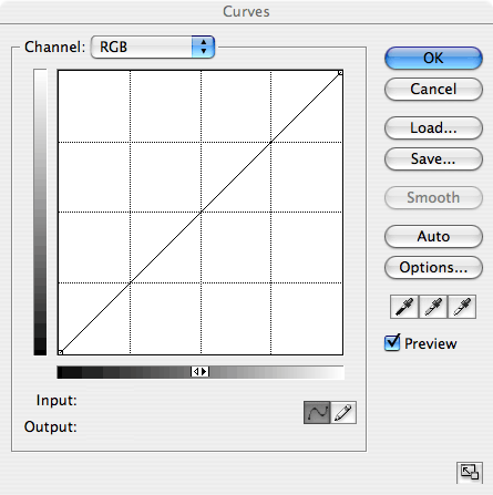
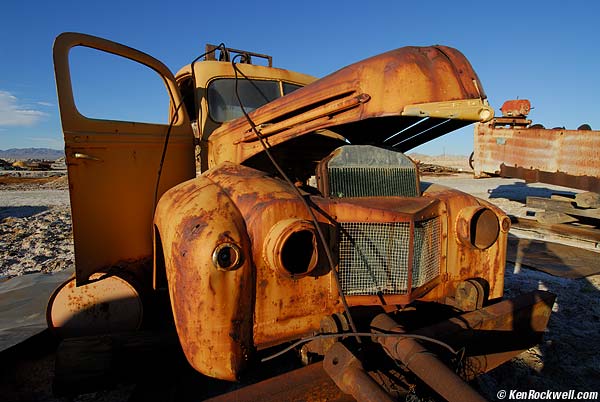
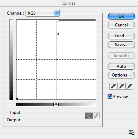
and Adorama. INTRODUCTION I use the Curves and Unsharp Mask (USM) commands to add contrast. Using Curves also boosts color while using USM tends to leave color alone. USM tends to add emphasis to large dark objects with subtle large halos while curves leaves this unchanged. I use curves to add a Velvia 50 punch to contrast and saturation. I use USM to bring dull images up to normal. You can use either one with similar results. Either one can be used artistically to add subtle optimization to take your image from ho-hum to perfect. Each also can be used too much, as I usually do, to make your images obnoxious. My work is all about color. Your work is probably different. My examples below show different amounts of additional contrast added with each technique. Therefore please don't misinterpret these examples to compare the relative strengths of each technique. Each can be as strong or as subtle as you wish. These tricks don't do much if your base image stinks. I get the colors I do by spending a lot of time looking for colors in nature and then waiting for (or returning for) the right light. The cliché I use below of an old truck was made out in the desert of an already bright truck lit by the last golden rays of afternoon sunlight. It looks decent straight from the camera. These tricks are helpful in fine-tuning your final image. They won't take crummy ones and make them sing. Only patience and skill can get you great colors. HOW TO: Curves Get into curves (command + M or make a new curves adjustment layer). You'll see a graph like this:
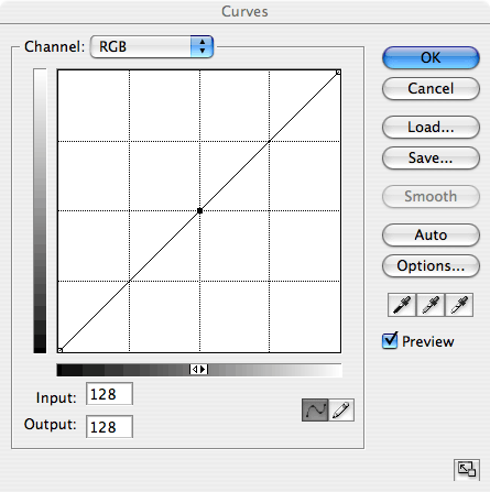
Click the little box in the lower right to enlarge it as you see above. Otherwise it comes out very small. Be sure Preview is checked so you can see what you're doing. Click on the middle of the graph (the central crosshair) to lock in 128,128. You'll see a little box appear at the middle like this:
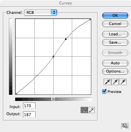
Grab the upper middle of the curve and drag it up. It will now look something like this:
Play with the position of the upper dot till you get the look you want. The more you push it, the higher the contrast and colors go. This S curve keeps blacks, mids and whites where they are. It expands midrange contrast while compressing the extreme blacks and whites. This is the best way to add contrast because you lose nothing: extreme highlights and shadows are untouched. Do this in color and the colors pop, too. This is better than using Photoshop's Contrast slider because it does not lose or clip highlights or shadows. EXAMPLES: Curves This is a "before" image. Move your mouse over it to see it after adding a curves layer. In this case I added just a little bit of contrast, which also pumps up the color. You can make it as insane as you want.
Clichéed Junk, California Route 66. Curves used add subtle contrast on mouse-over. This is the before image. It's in infrared, which is why it looks weird. Move your mouse over it to see after. I added a lot here.
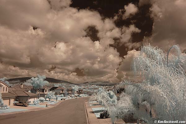
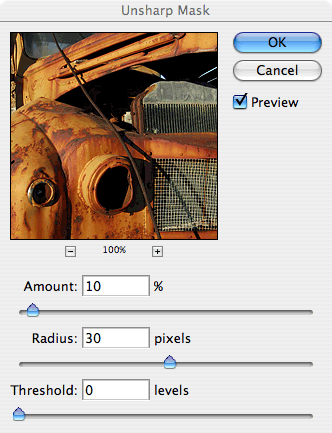
Suburban Sprawl, California. (Infra-Red) Curves used to add contrast on mouse-over. I made this shot with a friend's D50 he converted to IR. I'm working on an article about his D50IR. It works with the same exposure and as easily as a normal camera! Notice that in each example the darks get darker and the lights get lighter, but that absolute black and absolute white stay where they are. HOW TO: Unsharp Mask (USM) Get to Unsharp Mask via Filter > Sharpen > Unsharp Mask. Set the radius to about 20 - 100 pixels, instead of the default 1 or my preferred 0.3. Set the amount only to about 10% instead of the usual 50% or 150%.
Note how we use very little %, just about 10%, and a very, very wide radius of about 30 pixels. I use 30 pixels for web images like this. For full size digital camera images try starting with 200 pixels. Adjust to taste. You are using the USM to add local contrast over a broader region (30 pixels or so) instead of adding sharpness via adding contrast to a small region (0.3 pixels). EXAMPLES: Unsharp Mask (USM) I used the same base image as above where I added contrast through Curves, but added 20% USM at 30 pixels instead of using curves. This is a lot of additional contrast. Don't use these to compare USM vs. Curves, since I added more with the USM than I did in the curves example. Either way can be as subtle or as crazy as you want.
USM: 20% at 30 pixels. See the added contrast on mouse-over. EXAMPLES: Industrial Strength Here's what happens if you push it too far for each. Move your mouse over each to see the results.
Too much USM: 100% at 30 pixel radius. Move your mouse over the image. Going overboard using USM for contrast increases can blow out highlights and lose shadows. Notice the broad halo around the old truck. This next example goes overboard by pushing the curve too far. Move your mouse over it to see what happens:
Example of too harsh a curve for more contrast. You don't lose your highlights or shadows. It just gets too loud. Of course some of us like it this way! Notice there is no halo around the truck. EXAMPLES: Getting Thrown out of Class Here's what happens if you push it to the limit. These are for special graphic effects, not what I do personally. As before, move your mouse over to see the effect.
Too much USM: 500% at 30 pixels. With way too much USM you get completely washed out highlights and shadows. Notice how the highlights, like the 55-gallon drum head under the door on the left, have turned white, not colored. The color saturation in the highlights fades. Note also the strong halo around the truck, which adds emphasis.
Curves pushed too far.
Curve pushed so far it's almost vertical. See the dots? See the little dots along the center vertical line? That's the curve used in this example. You get this if you keep pushing the upper part of the curve up and over with your mouse in Photoshop. The resulting image looks the same as the threshold command (Image > Adjust > Threshold), and mathematically it is. Everything gets posterized into only eight different colors. (If you show this kind of posterized image on the web, the GIF format is more efficient than JPG.) Note how even with this extreme example that the brightest yellow, like the drum under the door on the left, stays yellow, and does not wash out to white as it does with too much USM. With curves light gray will bump up to white, and colored objects will get pushed into one of six primary additive (red, green or blue) or subtractive (cyan, magenta or yellow) pure colors. The other two of the eight total colors posterized this way are pure black and white. Curves accentuate color as well as contrast. USM tends not to alter color. Of course this presumes you're working in RGB. Work in other color spaces (you people know who you are) and you'll get different results. If you use curves and use them as an adjustment layer you can eliminate their effect on color by selecting a blending mode of Luminosity. I prefer, OK, love, the bumped up colors, but if you don't use the Luminosity blending mode for a curves layer and you can control contrast by itself. Class dismissed. Go have fun! Ken. |