Home Donate New Search Gallery Reviews How-To Books Links Workshops About Contact
LEICA M9 Color Rendition
© 2011 KenRockwell.com. This page best with Corporate S regular and bold activated.

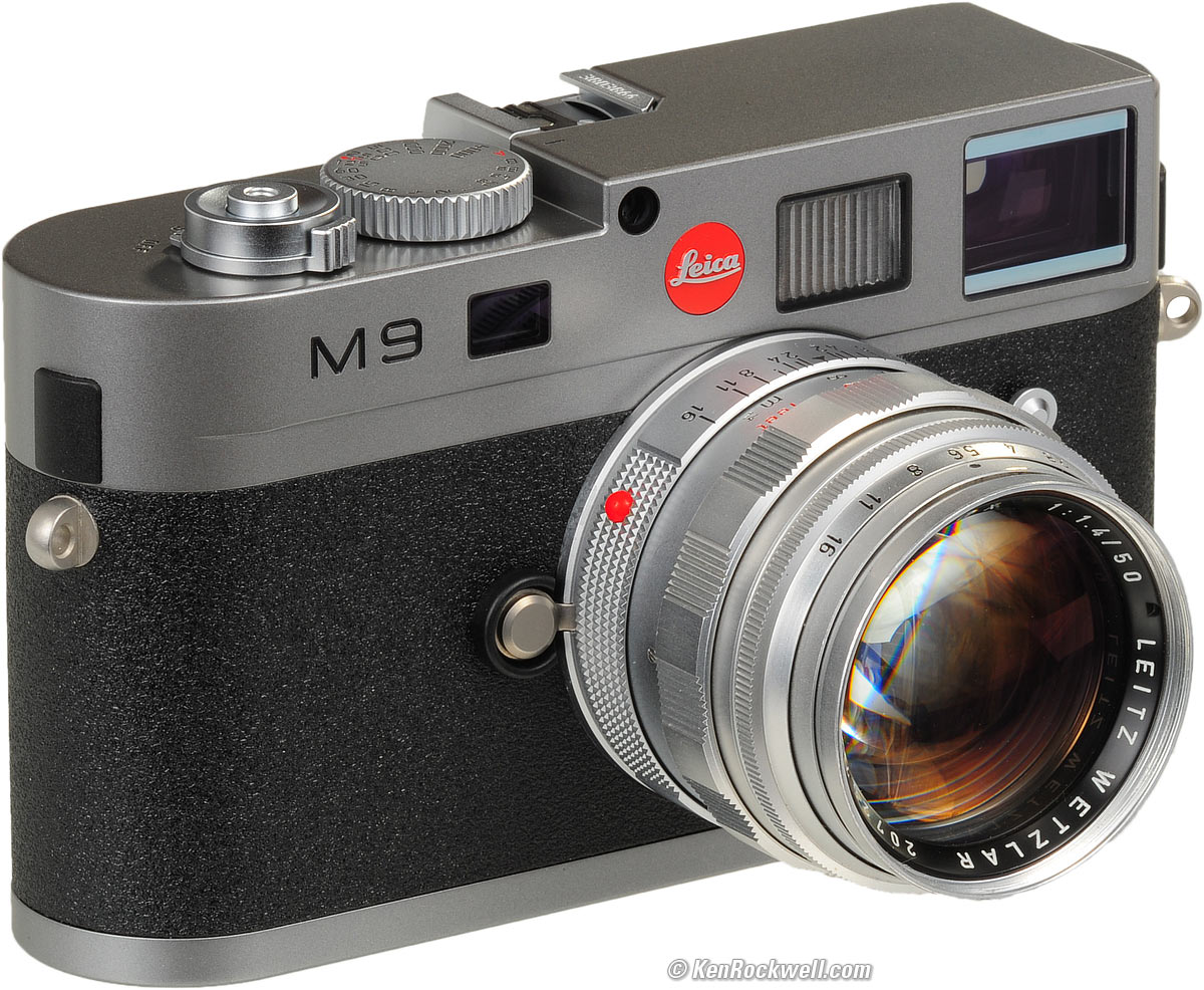
LEICA M9 with 1964 LEICA SUMMILUX 50mm f/1.4. enlarge.
Oktober 2011 LEICA M9 Review more LEICA Reviews
Introduction and Solution
I personally buy from Adorama, Amazon, Ritz, B&H, Calumet and J&R. I can't vouch for ads below.
|


Shot as JPG, LEICA M9 images have horrible color rendition.
Shot as DNGs and opened in most software, the M9's color rendition also looks pretty sad compared to most Oriental cameras.
How can this be? Simple: Leica is an optical and mechanical giant, but as a very small company compared to Canon or Nikon, Leica has no internal DSP or digital design ability. Leica is so unable to design its own digital cameras that it had to subcontract the M9's digital sections out to Jenoptik!
Contrast this to Nikon and Canon, the preferred camera of about 99% of the world's professional photographers. Each of Nikon and Canon have enormous ability to design all of their own digital cameras. They also have enough interaction with the world's best photographers (not dead black-and-white legends) to develop their own very-closely guarded secret sauces to make their images look great. Canon even designs and manufactures their own sensors! Leica has none of this; Leica is simply an old-world maker of the world's finest optics and mechanical cameras.
So how can we get great color out of the M9? It took me over a year to get here, and here's the secret: shoot DNG only, and process the files only in Apple Aperture 3. Personally, I prefer Saturation set to 1.2 for photos of things, or Saturation set to 1.0 and Vibrancy set to 0.2 for photos of people.
To use the same Apple Aperture import preset I use:
1.) Download this file to your computer. On Mac, OPT-click (or the hard way: right-click and select SAVE FILE AS). Simply clicking that link opens it in your web browser; that won't help you. You have to copy it to your computer.
2.) In Aperture, click the ADJUSTMENTS tab.
2.) Click the PRESETS drop-down just under the histogram at the top.
3.) Click the EDIT PRESETS option at the bottom of the drop-down.
4.) Click the gear at the lower left of the box that opens.
5.) Click IMPORT on the menu that opened.
6.) Select this file that you downloaded in your finder.
7.) Click IMPORT at the lower right of the finder box.
You only have to do this once.
To apply this preset, simply:
1.) Select an image in Aperture.
2.) Select the ADJUSTMENTS tab.
3.) Click the PRESETS drop-down just under the histogram at the top.
4.) Click the "Auto 2" option.
or
1.) select the preset when you're importing images into Aperture.
All raw software processes raw images differently, which is why all raw software creates different colors from the same raw data. For whatever reason, the secret image-processing recipes of transfer functions and color matrices in Apple's Aperture 3 can make the LEICA M9's colors sing like no other software.
The M9's Auto White Balance works poorly most of the time.
I shoot with White Balance set to 6,000 K, except under mixed artificial lighting, in which case I set it to AUTO. This gets me closest to the look I want with as little twiddling as possible in software.
Images on the rear LCD will always look horrible, as they are derived from the JPGs, even when set to DNG. The camera has no idea with what software you will be reading the files.
The M9's colors look so good shot as DNG and processed with Aperture 3 that I haven't shot any film ever since I discovered this process!
White Balance Presets for Aperture 3
If you need to get the effect of the M9's various WB presets from DNGs in Aperture:
1.) Download this file to your computer. On Mac, OPT-click (or the hard way: right-click and select SAVE FILE AS). Simply clicking that link opens it in your web browser; that won't help you. You have to copy it to your computer.
2.) In Aperture, click the ADJUSTMENTS tab.
2.) Click the PRESETS drop-down just under the histogram at the top.
3.) Click the EDIT PRESETS option at the bottom of the drop-down.
4.) Click the gear at the lower left of the box that opens.
5.) Click IMPORT on the menu that opened.
6.) Select this file that you downloaded in your finder.
7.) Click IMPORT at the lower right of the finder box.
You only have to do this once.
To apply this preset, simply:
1.) Select an image in Aperture.
2.) Select the ADJUSTMENTS tab.
3.) Click the PRESETS drop-down just under the histogram at the top.
4.) Hover over the M9 - PRESET option, float over the next menu that flips open to the right, and click on the White Balance you would like to apply.
Older Attempts
The rest of this article is from before I discovered that Aperture 3 solves my color problems, but look out: use any other software or shoot JPGs, and it still looks horrible. I had given up until I discovered Aperture's look.
Every camera is different. Accuracy isn't relevant because we're creating art, not simply reproducing reality. Absolute accuracy is meaningless, but rendering the natural world as you want it is critical.
The M9's American CCD with German DSP gives a very different look than the Oriental cameras and sensors to which I've become accustomed. It does not look the same, just as Agfa and Kodak film never looked like Fuji. Heck, Kodak used to make its film with different color balances depending on where they were selling it; everyone's tastes differ. I shoot my Velvia through an 81A even in the late afternoon, so that's me.
Personally I prefer the look of Fuji Velvia 50 over digital capture, but to each their own. I can shoot Velvia 50 in an M7 (or M3) for a fraction of the price of an M9.
Oddly, the M9's JPGs shot at ISO 80 look entirely different, and to me, much better, than those shot at every other ISO. Try ISO 80, 6,000K WB and a KR1.5 filter. DNG files have the same yuckier color balance at every ISO; ISO 80 doesn't help DNGs.
I find my M9's JPGs are often greener or yellower than I prefer, and there are no WB tweaks. It's almost as if they look like Kodak Ektachrome E100VS or E100G, and considering the source of the CCD (Kodak), that's probably why. Ignore the charts, graphs and text, but look at Herr Puts comparison versus Nikon. I'm seeing yellow skin tones on my M9, just as shown by Herr Puts.
Some people love the unique interpretation of the LEICA M9, while others, including myself, find it hideous, and I mean hideous!
I find the colors directly out of the M9 as JPG, or as default DNG, to be the worst I've ever seen in a digital camera. They are nasty, with greenish yellows, and everything looks really crappy. Technically the LEICA M9 images are unbeaten, but artistically, they look awful , at least to me.
Chacun à son goût, and many people love these colors. Bad reviews are good.
Oddly my own Example Images look fine to me; it's the indoor shots of the kids I can't yet get right. On the other hand, I can always tell when someone shot something on a Nikon in VIVID and +3 saturation; every digital camera brand and every film has its own look, and the artist chooses that which he prefers.
Usually I give up on cameras with ghastly color rendition, but the LEICA M9 has so much promise that I haven't given up. I think I'm finally getting to figuring out how to get usable pictures from it. When I say usable, obviously I'm drawing a high bar. I've already published pictures from Yosemite in 2009 that most people love, but I didn't.
The measure of a camera is how well its images look right out of the camera, not how well they look after an hour of fiddling in Photoshop.
I find Nikon DSLRs give great JPGs, just about as good as what you get after jacking around with NEFs for an hour. That's why I love JPGs, since I usually shoot Nikon.
With Canon, you're not doing as well. CR2s look much better (less cartoonlike) than JPGs out of a Canon DSLR since you can sidestep Canon's heavy noise reduction. If I was serious with Canon, shooting CR2 can give images with better texture, if you care.
With the LEICA M9, the JPGs out of the camera are atrocious. I have to shoot in DNG and tweak to get what I want, unless nasty green-gray-yellow tones were my thing.
I find the M9's images right out of the camera look a lot like Kodak Ektachrome 100G, whose colors I also hate compared to what I get from Fuji, and there's our answer: the same company makes both Ektachrome and the M9's CCD sensor in the same small city in upstate New York. They come from the same vision, and if you like Ektachrome 100G, you'll love the M9.
Here are two ways in which I'm starting to get decent results from the M9.
Hue Tweaks (forget these with Aperture)
Shoot DNG.
In Adobe Camera Raw (ACR) or some other tool, one must correct the color hues to get the greens out of the yellows and blues. One does this with the Hue sliders under the fourth green zigzag (HSL/Grayscale) tab in ACR.
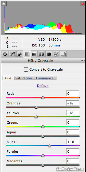
Do this, and add +50 saturation.
In this tab, I find I like something around -18 for oranges and yellows, which makes these colors more red (less green), and +18 for blues, which pulls the greens out of the skies and makes them more blue instead of cyan (greenish).
I also add about +50 to saturation, tweak the rest to taste, and wow!, reasonably decent color, along with images about twice as sharp on a pixel-to-pixel basis as a D700 or 5D Mark II.
In my case, tweaking some of the hues has made a HUGE improvement in what I've gotten from the M9.
Curves Tweak (forget these with Aperture)
This is a completely different and separate way to attack the problem.
Colorist Steve Dent tweaked some RGB curves, which when I drop them onto other images as an adjustment layer in Photoshop, appear miraculous in making my LEICA M9 images, shot unfiltered at 7,000K White Balance, pop.

Download this small 256kb PSD file, and drag its curves adjustment layer onto any other LEICA M9 file as opened in Photoshop.
Example DNGs
Since I shot all the Yosemite photos in DNG (and I've had many original DNG files shared in that gallery for you to download since last year), one fine day I just might redo that gallery.
I so love film. I got the colors I wanted right in-camera on my 55-year-old LEICA M3 on Velvia last year without any of this digital fooling around, but boy, the digital images out of the M9 are 3D by comparison with their sharpness and lack of noise.
My D3 gives better color right out of the camera; all this twiddling with an M9 merely gets me colors not quite as good, but with a lot more sharpness. Color is much more important than detail — ask any artist.
Perspective
So what's up with the LEICA M9 being the world's best digital camera, and at the same time, having such awful colors?
1.) The camera has nothing to do with the images it produces. Just as a great pen doesn't instill great penmanship, an artist can use any camera and make it do what he needs it to do. Given a pen that skips, an artist will find a way to express himself with it. Winners always find a way, while losers are those blame their problems on their gear.
2.) I hate the colors as they come directly from the M9, but who cares about what I think? Others love the colors. This is art: there are no "correct" colors, only what's correct for you, and now I've found some ways to make the colors much, much better, I am so much more stoked about the LEICA M9 for my own use than in previous months. I still prefer the LEICA M3 over the M9, and the LEICA M3 sells for less than a Nikon D90 today.
Help me help you top
I support my growing family through this website, as crazy as it might seem.
The biggest help is when you use any of these links to Adorama, Amazon, eBay, B&H, Ritz, Calumet, J&R and ScanCafe when you get anything, regardless of the country in which you live. It costs you nothing, and is this site's, and thus my family's, biggest source of support. These places have the best prices and service, which is why I've used them since before this website existed. I recommend them all personally.
If you find this page as helpful as a book you might have had to buy or a workshop you may have had to take, feel free to help me continue helping everyone.
If you've gotten your gear through one of my links or helped otherwise, you're family. It's great people like you who allow me to keep adding to this site full-time. Thanks!
If you haven't helped yet, please do, and consider helping me with a gift of $5.00.
As this page is copyrighted and formally registered, it is unlawful to make copies, especially in the form of printouts for personal use. If you wish to make a printout for personal use, you are granted one-time permission only if you PayPal me $5.00 per printout or part thereof. Thank you!
Thanks for reading!
Mr. & Mrs. Ken Rockwell, Ryan and Katie.
Home Donate New Search Gallery Reviews How-To Books Links Workshops About Contact