Home Donate New Search Gallery How-To Books Links Workshops About Contact
How to Use Photoshop
© 2012
KenRockwell.com

This free website's biggest source of support is when you use any of these links when you get anything, regardless of the country in which you live. Thank you! Ken.
January 2013 Better Pictures Nikon Canon Fuji LEICA All Reviews
Get the Newest Version of Photoshop
INTRODUCTION
Photoshop's Variations and Free Alternatives

Adorama pays top dollar for your used gear.
I use these stores. I can't vouch for ads below.
|
I have a different page that explains what Photoshop is, what the versions are and less expensive, or free, alternatives, here. I also talk about all the other software I use and photoshop plug-ins there.
I've been using Photoshop every day since the mid-1990s, so its cost is negligible for what I get out of it. If I was starting from scratch and didn't have $700 for the newest version of Photoshop, I'd first try iPhoto that comes for free with every Apple Mac computer, or Google's free Picasa for windows, and learn those. iPhoto and maybe the others even read RAW files, so don't ignore them.
How to Learn Photoshop
A huge advantage of Photoshop is you have more ways to learn it, like this page here, than any other program. So many people know it it's easy to learn just about anywhere.
The best way to learn Photoshop is to take a class at your local community college to learn the basics of Lightening Underexposed Images and Correcting Color Casts and White Balance Problems. These basic adjustments are covered in every introductory Photoshop class and book so I'll just cover them quickly below. You must be fluent in these to get anywhere with Photoshop for optimizing images.
Photoshop also has built-in help as well as free tutorial usually included in the box. All you need to do is choose how you learn best and go that way. Personally I learn best from an in-person class or having an expert show me in person. When I have a question about how to find some obscure tool or how to make a command work I just choose help from the HELP menu.
Basic Operation and Tricks of the Trade
All these adjustments work with every kind of image. That's why skilled photographers feel sorry for people who toil away with RAW files just so they can correct exposure and white balance later. You can do it all to any JPG image in Photoshop without all the hassle.
The tricks below presume you have at least a basic navigational familiarity with Photoshop. You can get that from any book or community college class, or even the built-in help!
Photoshop has been around since the 1980s when it was only used by professionals. It therefore uses terms from traditional professional photography and the commercial printing press trades. Often these terms are exactly the opposite of what you'd expect! The most obviously labeled tools are sometimes the worst way to do things, so read up below.
People spend entire careers learning Photoshop. There is more to learn than any single human will be able to master. Each of us learns what's relevant to our own work.
Lightening Underexposed Images
Correcting Color Casts and White Balance Problems
How to Change the White Balance of an Existing Image
TRICKS:
Digital Split-Toning 09 April 2011
Replacing Heads in Photoshop 20 December 2010
Pushing ISO in Photoshop 26 September 2007
How to Add Contrast in Photoshop
Making Great Black-and-White from Color
Correcting Converging Lines and Perspective
Correcting Color Fringes and Lateral Chromatic Aberrations
Perfectly Level Horizons and Perfectly Vertical Verticals
Adobe's Tips on Getting the Highest Performance
BASICS
Lightening Underexposed Images back to list
This isn't a trick; it's the most common adjustment I do. This works in every version of Photoshop and with every kind of file: RAW, JPG and everything.
If you're unsure of an exposure it's better to underexpose a digital camera and correct it later. This is perfect for shooting JPGs. This process is much easier and gives the same results as shooting RAW.
We do this in a few different ways.
LEVELS COMMAND
Go to the LEVELS adjustment either by IMAGE > ADJUSTMENTS > LEVELS or simply command + L.
You'll see a histogram; which is a graph charting the relative amounts of light and dark in your image. You'll see that it doesn't make it all the way to the right of the space in which it sits. Click and drag the little white slider on the far right of the histogram to the left, just enough to meet the rightmost edge of the histogram. As you drag it make sure PREVIEW is checked and you can see what you're doing. Hit OK and you're DONE!
Hold the OPTION key on Mac while doing this and the image will go to super-high contrast. Drag the white slider left until some points just start to sparkle out of the black background. Take your finger off the Option key to see how the image really looks.
CURVES COMMAND
This is a little more complex. This is better if you have an image with bright highlights and want to bring up the shadows in exchange for flattening the highlights a little. (see also Brightening Dark Shadows.) Deliberately underexposing a digital camera in contrasty light and then doing this actually improves the image over a conventional exposure, because it gives you the ability to create a shoulder for the highlights that's missing in digital cameras.
Call up curves by IMAGE > ADJUSTMENTS > CURVES or simply command + M.
Put the cursor on the lower middle of the diagonal line. Click and hold it and drag it up. Have fun, you can do an awful lot here.
Lighten and Darken back to list
DON'T use the Lighten and Darken commands.
Instead, use the Levels command, IMAGE > ADJUST > LEVELS (or use Command + L on the Mac).
To lighten and darken areas that are well exposed but just don't look right yet, first try dragging the middle gray triangle back and forth. Just do it till it looks right: this is art and not science.
You also can use the Curves command (IMAGE > ADJUST > CURVES or Command + M on Mac), which is more complex. See any Photoshop book for this.
Ignore the "Auto Levels" command, it rarely give good results.
Burning and Dodging back to list
DON'T use the burn and dodge tools!
Instead, use any of the selection tools to select the area you want to burn or dodge and then do as above to lighten or darken that area.
You can learn how to make a selection at your community college, the online help, the internet or a book. You learn what to select and what to do with that selection from art class and following your soul.
Feather the selection (SELECT > FEATHER) so that you don't have obvious hard edges to the altered area. Try a feather value of 2 to 10 pixels for the manipulation of a precisely defined area and try 100 to 250 pixels for a general adjustment to a non-specific broad area. Of course these values depend on the pixel size of your image and art. I always have my rulers set to read in pixels and I eyeball what the feather should be.
Correcting Color Casts and White Balance Problems back to list
This works in every version of Photoshop. It works with every kind of image, RAW, JPG or whatever. I'll cover three different tools, all of which do the same thing differently. These tools are the Color Match tool, the Levels tool and the Color Balance tool. All these tools are in every Photoshop version made in the past 10 years or so, but the Color Match tool has only been around a few years.
COLOR MATCH AND NEUTRALIZE TOOL
 |
 |
As
shot (AUTO White Balance) |
Neutralized
with Color Match tool |
This example was shot in a garage lit by both fluorescent and incandescent lighting while skylight was filtering in. The car is supposed to be white and the floor is supposed to be gray. The neutralized result is what you get automatically from the neutralize command inside the Color Match tool.
More recent versions of Photoshop have a color match tool for, as you guessed, matching colors. It also has a trick "neutralize" option! This is the easiest way to get rid of a color cast. Simply do:
IMAGE > ADJUSTMENTS > MATCH COLOR. Check the "Neutralize" option under Image Options and see what happens!
COLOR BALANCE TOOL
Go to IMAGE > ADJUSTMENTS > COLOR BALANCE or simply command + B.
Move the sliders.
I usually like things warmer than most people shoot them, so I tent to slide them towards Red and Yellow. This is how you change the color temperature or white balance setting of any image, even JPGs. Also wiggle the Magenta/Green slider to correct for fluorescent lights.
White Point Dropper
This lets you make anything a pure white. It's also is used to correct underexposure.
Go to the LEVELS adjustment either by IMAGE > ADJUSTMENTS > LEVELS or simply command + L. Look for a white eyedropper on the lower right of the adjustment panel. Click it. Now hover over your image and click on whatever part is supposed to be white. Voila! Photoshop makes it white.
This is a powerful tool so be careful. Click on something that is supposed to be blue and it turns everything red trying to make blue look white. Set your eyedropper sample size to 5 x 5 pixels to make this easier to use. You set this by clicking the eyedropper tin the tool pallet on the left first.
Gray Eyedropper
As above, Photoshop will adjust anything clicked with this dropper to be neutral gray. The gray dropper is between the white and black droppers. Be careful! Used properly it makes it easy to correct a discolored image. Used like a bonehead it makes things really nasty.
Everytime you click it you'll get a different result depending on where you clicked. Be careful to select something that really is supposed to be neutral, since a pixel of sky will turn everything red, for example. You can keep clicking the dropper around till you get the look you want. Also try to have the dropper sample size set under the eyedropper tool before you go into the levels tool to 5 x 5 pixels. Otherwise the adjustment is too sensitive and gets distracted by noise.
Black Dropper
Have hazy smoke or something you want to look black? Use the black dropper the same way. The black dropper is to the left of the other droppers.
How to Change the White Balance of an Existing Image (click)
Sharpening back to list
Do this as the last step after you've sized your image for its final use. Look at your image at 100% on your monitor. Use FILTER > SHARPEN > UNSHARP MASK.
Try a radius of 0.3 pixels. The default radius of 1.0 pixel tends to give sloppy results with amateur-looking halos around everything. Try setting the threshold to 3 if you have a film image or an image from a digital point and-shoot, and a threshold of 0 if the image is from a digital SLR camera. Try a percentage of sharpening that looks right. Usually around 150% looks good at a radius setting of 0.3 pixels.
Where did my brushes go?
If all you have is a crosshair, instead of the tools or brush you expect, release your caps lock key!
TRICKS
Lens Distortion Correction (click) back to list
Correcting Converging Lines and Perspective (click) back to list
Correcting Color Fringes (click) back to list
Perfectly Level Horizons and Perfectly Vertical Verticals back to list
I used to rotate the image by trial and error until I discovered how to get the exact rotation automatically.
Today the best way to fix this is with the lens correction tool in Photoshop CS2 just described above. You can do it for free along with correcting convergence. To correct rotation just select the angle tool on the upper left and drag it along something you need either vertical or horizontal. Easy!
In Photoshop CS and earlier use the "Measure" tool. Find it by clicking and holding the Eyedropper tool and dropping down to the Measure tool. I also get to this faster by pressing "I" three times which cycles through the Eyedropper, Color Sampler and Measure tools, presuming you've unchecked "use shift key for tool changes" in Photoshop's general preferences.
Click, drag and release the Measure tool from one side to the other of anything you want to be perfectly vertical or horizontal. For added precision do this at a large magnification and Photoshop will automatically scroll the image for you.
Now go to IMAGE > ROTATE CANVAS > ARBITRARY and, oh my golly, the exact image rotation is calculated and entered in the box for you! Just click OK or hit "Return" and you're done.
Well, not quite. Now that you have your image rotated a little bit you will want to use the Crop tool (just press "C" or select it from the tool palette on the upper left) to crop the image in enough to eliminate the crooked edges.
This does not correct everything if you have converging lines or lens distortions. That's why I love Photoshop CS2's Lens Correction tool.
Faux Infra-Red back to list
 |
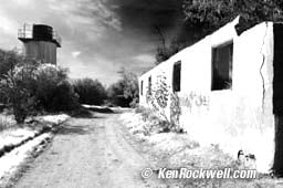 |
Before |
After |
1.) Make a duplicate of the background layer (in layers palette drag "background" over the new layer icon at the bottom of the palette next to the trash can)
2.) Make sure this new duplicate layer called "background copy" is selected (highlighted in blue)
3.) Make a new adjustment layer of type: Channel Mixer (click and hold the half black/white circle at the bottom of the layers palette and select "Channel Mixer" from the menu that pops up.)
4.) A menu box pops up for adjustment of the Channel Mixer.
5.) Check "Monochrome" at the bottom. (Leave it unchecked for a bizarre color effect.)
6.) Set R = + 100%, G = + 200% and B = minus 200% ( - 200%)
7.) set constant as needed for the correct brightness, usually about minus 28%.
8.) Click OK
optional:
9.) Add foggy blur: create and blur another duplicate layer and mix it to the percentage you prefer
10.) Add grain to taste (Filter > Noise > Add Noise)
Removing Dust and Scratches back to list
Photoshop CS2 quietly added a "Spot Healing Brush Tool" which makes this really easy. Select it in the tools pallet on the left and click around on your image. It magically fixes most every single blemish you click.
Before this tool some tried to use the Dust and Scratches filter on the entire image. Others like me used the rubber stamp tool, which was primitive because we also always had to go select source sample areas manually.
The dust filter usually softens the whole image and still misses the biggest chunks of dirt. This trick below for earlier Photoshop versions solves both problems, and it's faster than using the rubber stamp tool. With this trick we apply a much heavier dirt filter to cover even the big chunks, but we only apply it to the dirty parts of the image so it doesn't affect the sharpness or small details.
1.) Make a duplicate layer of your original. (Drag the BACKGROUND layer over the new layer icon on the bottom of the layers pallet.)
2.) Unclick the eyeball next to the top layer and select the bottom layer. This way we can see what we're going to do to the bottom layer.
3.) Apply a heavy dust and scratch filter to the bottom layer. (FILTER > NOISE > DUST AND SCRATCHES.) Don't worry about losing detail, just make sure it's set strong enough to cover the biggest defects.
4.) Reclick the eyeball next to the top layer and select the top layer. Your image now looks like it did to start.
5.) Use the eraser tool to cut through the sharp top layer to expose the filtered layer below in the spots with dirt. A more advanced way to do the same thing is to use a layer mask.
This way you can spot out the dirt quickly and not affect anything else. The new Spot Healing Brush pretty much does this by magic, BRAVO!
Brightening Dark Shadows back to list
As of Photoshop CS this is easy. In Photoshop 7 and before it was very difficult and required masking or advanced plugins from places like ASF.
Today all you do is go to IMAGE > ADJUSTMENTS > SHADOW/HIGHLIGHT and move the top slider to the right.
Tip: reset the defaults to have the amount at 0 each time you call up this adjustment. I have Tonal Width set to 50% and Radius set to 30 pixels most of the time.
I rarely play with the highlights. On a digital capture if you blew out the highlights you're dead; trash the image for good.
 |
 |
from
camera |
after
this trick |
(you can see someone else's screen shot illustrating this same technique here.)
Make a new Layer
LAYER > NEW > LAYER. In the box that pops up:
Name the layer something like GRAD and set MODE drop-down to SOFT LIGHT. Click OK.
Your new layer should be highlighted in the layers pallet on your lower right, and it should be transparent. Photoshop shows transparency as a gray checkerboard.
Create a black-to-transparent gradient from top to horizon in the new layer
Select GRADIENT TOOL from the tools palette on the upper left. The Grad tool is halfway down the right side of the tools pallet and is shared with the Paint Bucket Tool. You might have to click and hold the Paint Bucket to get the grad tool.
Be sure you have the default foreground and background colors, black and white, chosen. These colors are seen as the two overlapping color squares towards the bottom of the tools palette. You can reset them to default black and white by pressing the tiny little black-and-white pair of overlapping squares next to them, or just press "D" on your keyboard.
Make sure the "linear" option is selected as the first of five little icons on the top middle left of the gradient tool option bar across the top of your screen. Hover over it and you'll see it say "linear gradient."
Select the black-to-transparent grad. Do this by clicking the little arrow to the right of the grad seen at the top left of the top tool options bar. An illustrated menu of grads will drop down. Choose the one that goes from black to transparent (gray checkerboard).
Put your mouse at the top of the image. Click, hold and drag it straight down till you reach the horizon. Release it at the horizon. You can ensure that this is straight by also holding the Shift key while you do this.
You now should see a little dark-topped grad in the layers palette., and even better, the clouds should have gotten dark and scary looking at the top of your image. The brightest parts at the top should have stayed bright. This is a handy effect all by itself.
Create an Adjustment Layer between the two existing layers
Click on the Background layer in the layers palette. It will highlight in blue.
Click and hold the black/white circle at the bottom of the layers palette.
Choose Selective Color from the drop down menu. Release your mouse.
Choose Cyans at the top. Then set the Cyan slider to 100% and the Magenta slider to 100%. Don't click OK yet.
Choose Blues at the top. Then set the Cyan slider to 100%, the Magenta slider to 100%. Click OK.
You can fool around with the selective color settings to your heart's content. Just double click the black/white circle on the left of the middle blue highlighted layer in the layers palette. and choose different values for the sliders under Cyans and Blues. 60% are also good values. Leave the black sliders at zero. Also try about 25% for the yellow slider under Blues.
Feel free to make a layer mask to prevent the effect from working elsewhere in your image.
I'm sure you also can get the same effect with Nic Color EFX with a lot less effort. See my plug-ins info here.
Adding your Copyright Notice back to list
Basics
1.) Use the TYPE tool. That's the big "T" in the tools pallet on the left. You get the © symbol by pressing OPTION + G on your Mac. I use 10, 11 or 12 pt type at 72DPI with a drop shadow to bring it forward against even light backgrounds. Use the MOVE tool to drag it where you want it.
1a.) Heaven help you if you're on windows, since it's a royal pain to get the © symbol on a windows computer, another reason professionals use Apple. On PC I usually just fudge with (c) instead of ©. To make the © symbol on a PC, hold down the ALT key and press 0169 on the numeric keypad on the right of the keyboard, NOT the numbers along the top of the keyboard. If you are on a laptop you are really in trouble since you have no separate numeric keypad and have to use the NUMLOCK command! You first
a.) need to put the laptop into NUMLOCK mode (another screwy two-finger function key) and then
b.) hold down ALT and
c.) type 0169, but you have to type 0169 NOT on the regular numeric keys along the top row, but the
d.) letter keys specially marked with teeny numbers that correspond to the numbers in NUMLOCK mode.
e.) After typing all that remember to take the laptop out of NUMLOCK mode or all your other typing will be messed up! Now do you see why we all use Apple computers?
Because of all this most people stuck on windows simply copy and paste a good © symbol from some other document!
Another way to find the © on Windows is to:
Start > All Programs > Accessories > System Tools > Character Map.
(or)
Start > Run,
type "Charmap" and hit enter. The next time, just hit Run > enter.
You also could create a desktop shortcut to Charmap.
In Character Map select the character you need in the font of
your choice. The copyright symbol is only one of thousands of potential
characters.
One Click
Once you've learned the above, you'll want to be able to do this with a single click each time instead of typing. Especially for the PC, you can save having to do gymnastics to get the © symbol each time and set up the drop shadow and text properties. In PhotoShop we call these recordings "actions," thus
1.) First be sure your image is sized for final use. If not, the type will come out the wrong size. Set the resolution under IMAGE > IMAGE SIZE. For web and email set the resolution to 72DPI, otherwise, just be sure the image's resolution is set to whatever its final value will be.
2.) Find the ACTIONS palette.
3.) Click the right arrow to the right on the top of the actions palette which calls out a menu, on which you
4.) Click NEW ACTION, name it something, and hit RECORD. (You'll see a red light at the bottom of the actions palette light up to let you know you're recording.)
5.) Do all the typing and font selection and drop shadowing to your taste.
6.) Stop the recording by hitting the black square ("stop") button to the left of the red one at the bottom of the actions palette and you're done. Tip: even many experienced people get distracted in the middle of this and do a day's work without remembering to hit the "stop" button. This winds up recording everything you did that day as the action! In this case, hit stop, delete that recording by highlighting it in the actions palette and dragging it to the trash icon at the bottom of the actions palette. Another tip: when recording an action place the text in the middle of the image. Since images tend to be different sizes and shapes you usually will want to drag (use the MOVE tool) your text manually to the best location each time.
7.) To play this back next time, just select the action you recorded in the actions palette and click the triangular "play" button at the bottom of the actions palette. You'll get your © notice immediately. Now just use the MOVE tool to drag the text where it looks best.
Also see any book or class or help section of PhotoShop to learn how to do these actions.
Auto-Magic Positioning
Instead of moving the copyright notice on every image, you can make the text automatically align to any specific spot (like the bottom-right corner) no matter the size or dimension of the image.
1. Once you've created the text and styles, choose Select -> All.
2. Make sure the text layer is active. Choose Layer -> Align Layers to Selection, then choose the appropriate location. Use combinations for corners, like Bottom Edges and Right Edges. Deselect the selection.
3. The text will usually will be too close to the edges at this point, so to move the text and maintain a universally applicable action, use the Transform tool to move the text. Make sure the text layer is active. Choose Select -> Transform Selection and use the directional arrows on the keyboard to nudge the text away from the edges. The action will remember how many spaces the text was moved in the transformation. Click the check mark to set the transformation.
4. At this point one usually merges the layers together. If you want the ability to fine tune you can stop recording the action before merging.
You can make a couple actions for the different sides of the image like one for the bottom-right and one for the bottom-left.
One Click for Hundreds of Images
If you want to apply this action to many images at once:
1.) Put the photos in a folder, then
2.) Use Photoshop's FILE > AUTOMATE > BATCH command to perform that action on all of them. You will probably have to move the text around manually for optimum placement in each image as I do.
I have heard of a program here (Mac only) to automate this process even further. It superimposes one image over as many other images as you have in a folder.
Camera RAW Plug-in back to list
Here's a great article on how to calibrate this plug-in to your camera. Personally I avoid all this complexity and shoot JPG as you may read here.
Adobe's Tips on Getting the Highest Performance
Glossary of Terms & Tools
NEW: How to Add Contrast in Photoshop
Where to get older versions:
Newest
2005 Mac Version CS2 (9.0)
Newest 2005 Windows Version CS2 (9.0)
Previous
Mac Version CS (8.0)
Previous Windows Version CS (8.0)
Previous
Mac Version 7.0
Previous Windows Version 7.0
Help me help you top
I support my growing family through this website, as crazy as it might seem.
The biggest help is when you use any of these links when you get anything, regardless of the country in which you live. It costs you nothing, and is this site's, and thus my family's, biggest source of support. These places have the best prices and service, which is why I've used them since before this website existed. I recommend them all personally.
If you find this page as helpful as a book you might have had to buy or a workshop you may have had to take, feel free to help me continue helping everyone.
If you've gotten your gear through one of my links or helped otherwise, you're family. It's great people like you who allow me to keep adding to this site full-time. Thanks!
If you haven't helped yet, please do, and consider helping me with a gift of $5.00.
As this page is copyrighted and formally registered, it is unlawful to make copies, especially in the form of printouts for personal use. If you wish to make a printout for personal use, you are granted one-time permission only if you PayPal me $5.00 per printout or part thereof. Thank you!
Thanks for reading!
Mr. & Mrs. Ken Rockwell, Ryan and Katie.
Home Donate New Search Gallery Reviews How-To Books Links Workshops About Contact