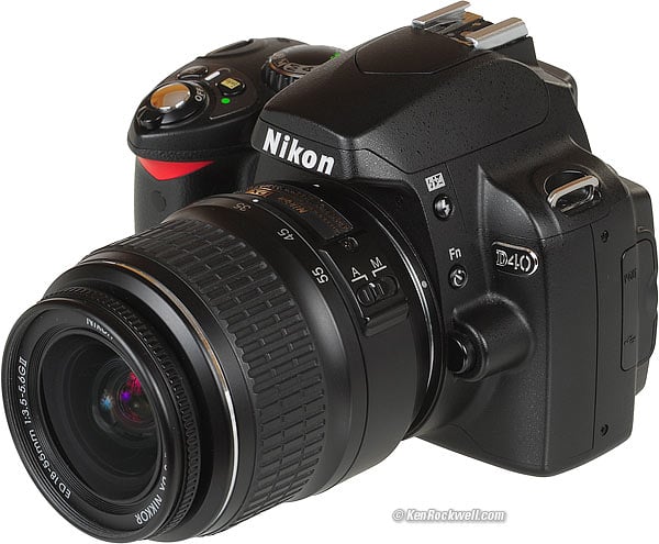
Nikon
D40 Shooting Menu
© 2007 KenRockwell.com

NEW: Nikon D40 Guide iPod and iPhone App 08 July 2009
Back to top of D40 User's Guide.
Back to D40 User's Guide page index.
SHOOTING
MENU
(camera icon)
I personally buy from Ritz, Adorama and Amazon. I can't vouch for any other ads.
|


Want free live phone support? In the USA, call (800) NIKON-UX, 24 hours a day, 365 days a year.
Want a free in-camera photo class with built-in examples of all the settings? Press the < i > button twice. Select a setting with the Up/Down/Left/Right button and press OK. You'll see photo examples as you change most of the settings.
Many of these menu options are shown only after you select the FULL MENUS option in the Setup Menu and are often deactivated in anything except the P, S, A and M modes.
This menu really should be called the Film menu and shown with an icon of a roll of film. More camera settings, like autofocus, flash and timers, are set in the Custom Settings Menu, shown by a pencil. This is Nikon's mistake; don't penalize yourself if the menu names and icons make little sense at face value.
How to Get There
Press MENU, click left and then up and down to select the camera (shooting) menu. You'll see "SHOOTING MENU" on the top of the LCD monitor.
What it Sets
It sets parameters related to what film used to do. The Shooting Menu sets ISO, grain, contrast, color and a zillion other critical things that set the look of your images.
The shooting menu would make more sense if it were called the Film menu, since many other menus also affect shooting.
The D40 appears to have all the custom image tweaks of the D2Xs and other Nikons. I can't see anything missing except the high ISO NR strength. The D40 does have selectable dark-frame subtraction noise reduction!
What I Change
I change a lot here. This is where I get the wild colors I love from my D40.
This is where you set the look of your image, like the saturation I love.
These choices are art. There is no right or wrong if you know what you're doing and know what you want.
I'll tell you what I use. Ignore me and Be Yourself if you prefer a different look.
Preset Choices
There are six fixed preset modes. They cannot be altered. They are:
N Normal
SO Softer
VI Vivid
VI* More Vivid
PO Portrait
BW Black-and-White
You might think I would use Vivid or More Vivid, except that they crank up some of the contrast and sharpness settings and leave them there. I want vivid colors, but leave the contrast and sharpness on Auto. This way as subjects get contrastier I don't have to stop and turn the contrast back down. In VI* you can easily blow out a slightly high-contrast scene.
Therefore I use the Custom (pencil icon) setting:
Custom (pencil icon)
This is where Nikon hides the critical adjustments other camera makers make more obvious.
Canon lets you define many of these and recall them easily. Nikon only gives you one setting. Canon also gives you a wider and more precise range of adjustments, and therefore it's easier to make bad mistakes with Canon. The extreme settings here aren't very extreme. Play to your heart's content and see what you prefer.
Done
"Done" is the most important Custom Optimize Image menu item. If you forget to select it and then click to the right to select OK it forgets everything! Always remember to select DONE and OK after you change any of the settings below, otherwise they will be ignored.
Image Sharpening
I leave mine on AUTO. I've never messed with the manual settings. Sharpening is an artificial effect not to be confused with sharpness. When I first got a digital camera I thought: "cool, I'm cranking this to 11," and realized my error. Don't turn it up for no reason, since the image can start to look artificial. Play with it if you want. I've played with it out of curiosity, and always leave it on AUTO.
Tone Compensation (Contrast)
Nikon meant to say Contrast. I always leave mine set to AUTO. In AUTO the D40 automatically applies the Zone System and adjusts contrast to match your subject, for each and every shot!
If Nikon's marketing department was paying attention, they would promote this as Automatic Dynamic Range Optimization, since that's what it does and Canon has nothing like this.
The D40 automatically lowers contrast and increases dynamic range for very contrasty subjects, and cranks up contrast for dull subjects.
Saturation also varies with this setting. If you crank it to + it looks vivid and bold for flatter subjects, but when you have a contrasty subject it's too much and blows out. Leave it in AUTO and you won't have to piddle with it.
Avoid Custom tone compensation. Most people call this a custom curve. I've never used it. To use it you have to buy Nikon Capture and create a curve. You then use Nikon capture to load it into the D40. Once you've done that you select it here. If you haven't loaded your own custom curve and select this you get the default Normal curve. Custom curves are way beyond anything with which I want to bother. The curves in the camera are the best ones anyway. Real photographers pay more attention to their subject's lighting.
Color Mode has three settings:
Color Mode Ia (one-a, sRGB) is boring.
Color Mode II (two, Adobe RGB) gives dull colors. Don't touch this unless you really know what you're doing and print your own work. See Adobe RGB vs. sRGB.
Color Mode IIIa (three-a, also sRGB) gives bolder colors. I use it all the time. Its the default.
I have no idea how Nikon cooked up these numeric designations.
Saturation
This sets the vividness (strength) of colors.
A Auto: This is the default, which presets the color settings to follow the preset scene modes on the top dial. I prefer always to have my saturation cranked up.
0 Normal: For normal people shots you're probably better off with 0.
- Moderate: tones down the colors, which I've never liked. "Moderate" sounds like British understatement. In America we call this "dull and boring." Personally I want colors so bright you have to put on sunglasses, or I go directly to B/W. Your interests and taste will differ.
+ Enhanced: I prefer violent color, so I crank it up to +. I'd use ++ or +++ if my D40 had it, but that's me.
Hue Adjustment
Don't touch this! This rotates all your colors to different spots around the color wheel. If you use this to fix one color it screws up all the other colors. God only knows why this adjustment is here.
This selects the kind of file (raw, JPG or both), and the size of the JPG file (FINE, NORMAL or BASIC).
I always use JPG, never raw. (see JPG vs. Raw.)
I usually use BASIC JPG and sometimes NORMAL JPG.
BASIC JPG looks almost the same as NORMAL, unless you're making six foot wide prints. It also makes a file half the size of Normal, which speeds up everything and saves space on my hard drives and backup CDs.
I never use FINE; it looks the same as NORMAL and wastes space. Feel free to use any settings you like; that's why they're here.
You can see examples from my D200 at D200 Quality Setting Examples.
This selects L, M or S image (pixel) size for the JPG images. I always use L.
I print L BASIC JPG files at 12 x 18" (30 x 50 cm) and they look great.
I might use M if I'm shooting many hundreds and hundreds of images of something I don't expect to print larger than 8 x 12" (20 x 30cm), like sports, weddings and parties.
I leave my WB at AUTO. See also How to Set White Balance and White Balance Examples.
Trick: to fine-tune (make warmer or cooler) each setting individually, after selecting it in the menu, press OK (or click right) to get to the +3/-3 trim setting. + is cooler (bluer) and - is warmer (more orange). This delicate, but critical, adjustment is missing from the D50, and it was my biggest complaint about the D50.
The WB settings are:
Auto (A): I use this all the time. It makes its best guess for WB. It's usually very good. Indoor tungsten can be too orange unless you have some bright tungsten light also in the image. If you do, it removes the orange and compensates completely. If not, the D40 only partly compensates and you get a nice warm image instead.
Tungsten (hanging light bulb icon that's easy to confuse with the sun icon): This makes the picture very blue. Use this only for deliberate Arctic freezing effects, or under conventional tungsten light bulbs.
Fluorescent (glowing tube icon): Used to make crappy fluorescent light look less crappy. These settings rarely work; use the preset setting for better results.
Direct Sunlight (sun icon): Use this in direct frontal sunlight. Use other settings for shadows or indirect sunlight.
Flash (lightning bolt): I never use this. It's almost the same as direct sun. I'm told it's really for studio strobes, since the Auto mode compensates magically for flash if you use it on-camera. The reason to use this is if you use a different trim value for your strobes than you do for sunlight.
Cloudy (cloud): Warmer (more orange) than the sunlight position. I use this in shade, too.
Shade (house casting a shadow): very warm (orange). Use this for sunset shots and deep shade.
Preset (PRE): You use this setting with a white or gray card to get perfect color matching.
I use this in bizarre artificial light that I wish no make look natural, or to get exact color with my studio strobes. An Expodisc makes this easier, but even without an Expodisc or white card I shoot off anything neutral, like a piece of paper or a T shirt.
Any light weird enough to need this setting won't care about small inaccuracies in the neutral reference.
To set this:
1.) Ensure your card or other neutral object is in the light representative of the light on the subject.
2.) Select PRE via the menu button (or the Fn button and spinning the dial).
3.) Press OK (or click to the right).
4.) Select Measure and click OK (or to the right). (The Use Photo option is a backwards bow to Canon's convoluted setting method. Canon Jihadists used to brag about this. It does the same thing, but requires twice as many steps. Ignore this option.)
5.) Select YES.
6.) Point your camera at the card or neutral colored thing and press the shutter.
7.) If the LCD says "data acquired or the viewfinder flashes "Gd," you're set. Shoot away!
8.) If the display flashes "unable to acquire" or the viewfinder flashes "no Gd" then repeat from step 2.).
I usually set my ISO to 200 and let the D40's Auto ISO adjust as needed.
Auto ISO makes all the ISO adjustments for you. I always use Auto ISO since it's as smart as I am.
Firmware Defect #1: the Auto ISO options are hidden in the Custom Settings Menu, where I explain them in depth.
Firmware Defect #2: The Auto setting in this ISO menu refers instead to letting the D40 preset the ISO as it guesses appropriate to the preset scene modes (sports, portrait, macro, etc.) as they are selected. This Auto setting isn't Auto ISO, and it isn't available in the P, S A and M modes I use.
Higher ISOs can give sharper images in dimmer light because they let the D40 shoot at faster shutter speeds or smaller apertures, but they also can add more grain (noise) to your photos.
ISO 200 gives the cleanest images, but the most potential for blur in dim light.
ISO 400 and ISO 800 are perfect for outdoor sports.
ISO 1,600 gives the noisiest images, with the least potential for blur. ISO 1,600 still looks pretty good if you need it, but I only use it indoors.
ISO 3,200 is for use as a last resort. It is grainy, and lets you shoot in the dimmest light without flash.
Auto ISO selects magically among all these (except for ISO 3,200) so you and I don't have to worry about it. See Auto ISO.
Hint: ISO goes from 200 to 3,200. Nikon code-names ISO 3,200 as "HI 1" to scare amateurs away from using it, because these same amateurs would clog up Nikon's (800) NIKON-UX support lines complaining about grainy photos.
Hint: If you've set AUTO ISO ON, Auto ISO turns off if you select ISO 3,200. Auto ISO come back on when you set a lower ISO.
Noise Reduction
This is short for Long Exposure Dark-Frame Subtraction Noise Reduction.
It doesn't reduce noise or grain. It will eliminate the occasional hot pixel, and correct purple fog around the edges of insanely long astronomical exposures.
OFF: Default. Leave it here.
ON: Don't use this. If you do, the D40 will double the amount of time you have to wait around for time exposures of a second or longer. You people who need this know who you are, and even for you I suggest trying the D40 with out NR first. it may save you a lot of time waiting around out in the cold.
I have details with examples from my D200 at D200 Dark Exposures.
back to top of page back to top of Nikon D40 User's Guide
MENUS
CUSTOM SETTING MENU < NEXT
PLUG
I support my growing family through this website.
If you find this as helpful as a book you might have had to buy or a workshop you may have had to take, feel free to help me continue helping everyone.
If you've gotten your gear through one of my links or helped otherwise, you're family. It's great people like you who allow me to keep adding to this site full-time. Thanks!
If you haven't helped yet, please do, and consider helping me with a gift of $5.00.
It also helps me keep adding to this site when you get your goodies through these links to Adorama, Amazon, B&H, Ritz, and J&R. I use them and recommend them all personally.
Thanks for reading!
Ken